Cookies
We serve cookies on this site to analyse traffic and optimise your experience.
When people say “Braun is timeless,” they usually mean “it looks minimal.” But minimal isn’t timeless. Minimal can be trendy. What’s timeless is repeatable order.
That distinction becomes clear the moment you stop looking at Braun products and start looking at everything around them: the price card, the leaflet, the instruction manual, the window display. These things don’t feel styled. They feel settled. As if the decisions had already been made long before the content arrived.
To understand why, we went back to the Braun visual manual itself. Not to extract rules, but to read it as a working document — a tool meant to be used daily. What it reveals is not a graphic language, but a logic of control: how Braun used grids, spacing, and measurement to make design behave predictably in the real world.
The raster is the decision
The first thing the manual does is remove choice.
Before any product, image, or text appears, Braun defines the raster — fixed fields for DIN formats, shown again and again as empty containers. These aren’t example layouts. They’re capacity plans.
Each raster reserves space in advance. Margins are locked. Columns are repeated. White space is not negotiable. The red outlines don’t suggest where content could go — they define where it must stay.
What’s striking is how little freedom is left on purpose. The system assumes that information will vary, but structure must not. By solving alignment, spacing, and proportion upfront, Braun eliminates the risk of improvisation later.
The calm you feel in Braun communication starts here: not with typography, not with imagery — but with the decision that space itself is part of the product.
White space as a fixed value
In most graphic systems, white space is what remains after content has been placed. In Braun’s system, it’s the opposite.
The raster pages make this explicit. Usable areas are clearly defined, and everything outside them is protected. This outer zone isn’t decorative emptiness — it’s a buffer that keeps information from collapsing inward.
Because these margins are consistent across formats, Braun layouts feel familiar even when the content changes. Your eye knows where to rest. Nothing presses against the edge. Nothing needs to shout.
This is one of the most overlooked parts of the system: white space is treated as a constant. And constants are what make systems repeatable.
Typography governed by distance, not decoration
The typographic pages in the manual read almost like engineering notes.
Font sizes are specified in points and translated into millimetres. Line spacing is defined numerically. The distance from baseline to baseline is as important as the letterforms themselves.
What’s missing is just as telling: there is no encouragement of expressive emphasis. No italics. No underlining. No letterspacing. Even bold is restricted.
Hierarchy is created through scale and separation, not styling. Headings are larger, not louder. Important information is isolated by space, not ornament. Body text remains left-aligned and unforced, allowing rhythm rather than symmetry to guide reading.
The result is typography that doesn’t perform. It behaves. And because it behaves consistently, it never distracts from what it’s describing.
The grid continues into price cards and retail material
Where many identity systems break down is retail. Braun anticipated this. The price-card system shown in the manual is fully modular: defined text sizes, fixed hierarchies, predictable spacing. Even promotional elements like “Neu” are not treated as exceptions — they are designed as components that snap into the same structure. Red is used sparingly and consistently, almost like a technical signal rather than a brand flourish. Prices lead. Product names follow. Descriptions sit quietly underneath, separated by deliberate gaps. This is where the grid proves its worth. In a shop window or on a shelf, nothing competes. The system absorbs commercial pressure without losing clarity. That’s not taste — that’s planning.
Images as modules, not moments
The image-format diagrams are among the most revealing pages in the manual.
Every image size is predefined. Square, horizontal, vertical — each with exact dimensions. If an image doesn’t fit the rectangle, it must be placed onto one. Decorative framing is not allowed.
Even perspective is regulated. Photography should avoid dramatic angles and uncontrolled depth. The image must sit calmly inside the grid, not challenge it.
This turns imagery into a modular element. Products can change. Campaigns can rotate. The structure remains intact. That’s why Braun communication never feels dated: the system doesn’t rely on photographic trends to work.
Where the system disappears — and that’s the point
The final effect of the Braun grid system is that you rarely notice it. You notice that instructions feel readable. That price cards feel trustworthy. That window displays feel composed without being theatrical. That manuals feel calm even when they’re dense. The grid doesn’t ask for attention. It removes friction. That’s the difference between a style and a system. Styles age. Systems hold. Braun understood that timelessness isn’t achieved by removing detail — it’s achieved by controlling it.
 Lifestyle, Products
 History
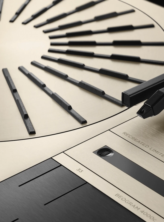 Products, Design