Cookies
We serve cookies on this site to analyse traffic and optimise your experience.

Before sleek unboxings and algorithm-curated ads, there was a time when technology was sold through bold typography, unapologetic colors, and ideas that felt futuristic yet deeply human. Retro tech advertising—especially from the ’70s to the early 2000s—not only sold products, it sold dreams: of freedom, individuality, and control over the new digital age. These vintage visuals weren’t just informative, they were cultural artifacts. At Only Once Shop, we’ve curated a collection of iconic retro ads that capture this spirit—and yes, you can own a piece of it.
 Copyright: Apple Inc
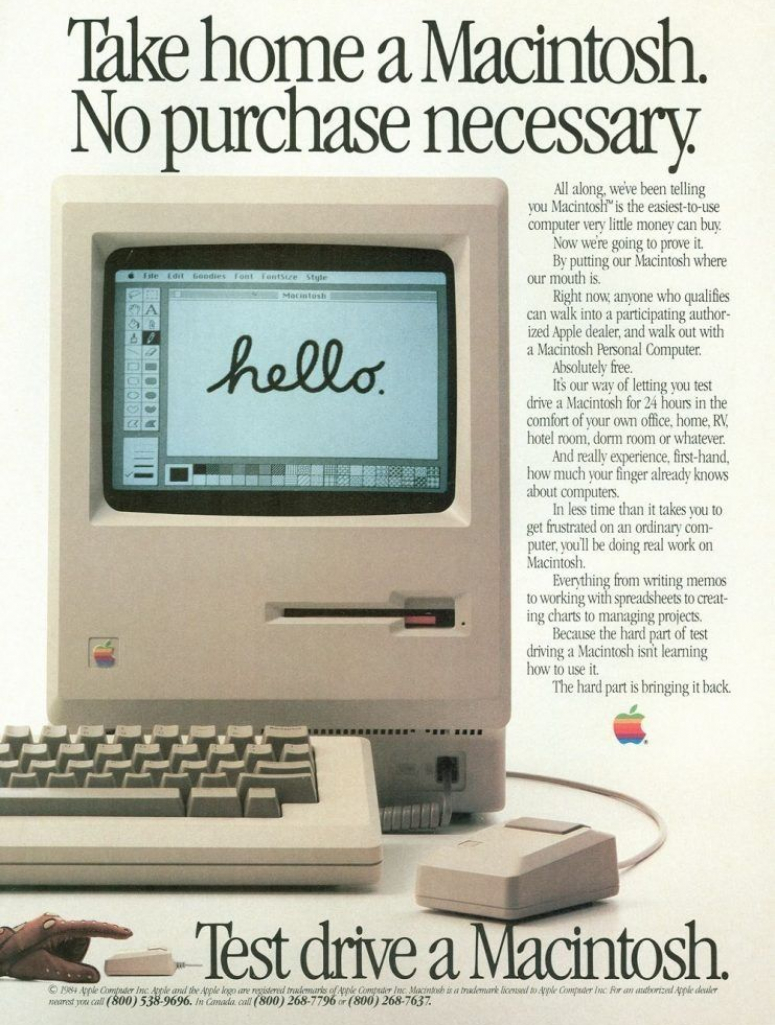
Apple: The Art of Restraint
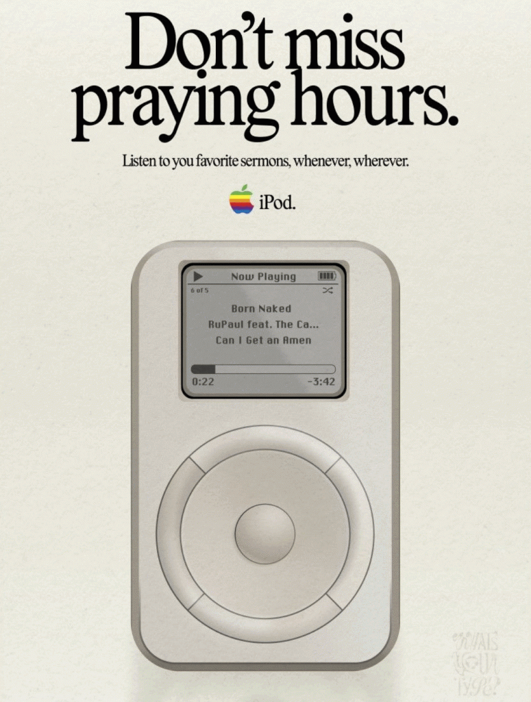
Few brands mastered minimalism like Apple did in the late ’90s and early 2000s. From “1,000 songs in your pocket” to “Sorry, no beige,” Apple’s ads spoke volumes with just a few words and a product shot. The iMac’s colorful debut and the unapologetically cheeky “Yum” tagline reshaped how we saw computers—not as tools, but as lifestyle objects. These ads were as much about identity as they were about functionality. The posters are now visual relics of a cultural shift—and three of them are available in our shop: “1,000 Songs in Your Pocket”, “Yum” iMac Ad, and “Black Tie Optional” PowerBook Ad....
Iconic Apple Ads
...These ads were as much about identity as they were about functionality. The posters are now visual relics of a cultural shift—and three of them are available in our shop: “1,000 Songs in Your Pocket”, “Yum” iMac Ad, and “Black Tie Optional” PowerBook Ad.
 Copyright Apple Inc
 Copyright Bang & Olufsen
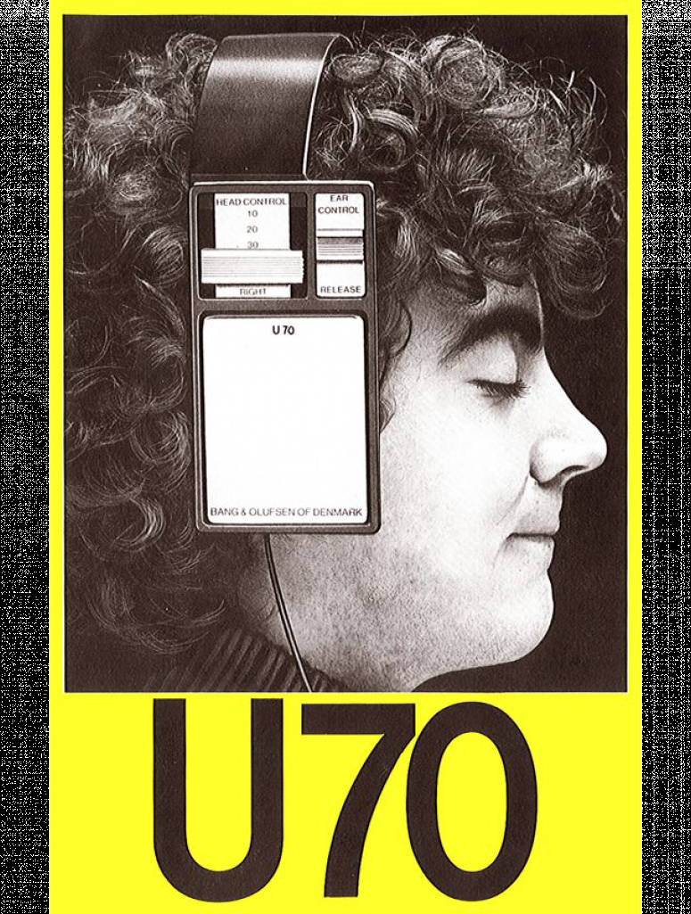
Bang & Olufsen: The U70 Vision
Then there’s the brilliant eccentricity of Bang & Olufsen’s U70 headphone ad. A large, blocky headset covers half of the model’s face, merging machine and man in a moment of auditory bliss. The interface-like design of the headphones, combined with the contemplative expression and bold yellow typography, make this ad feel both industrial and poetic. It’s a perfect symbol of Scandinavian design principles: functional, quirky, and deeply aesthetic. This piece reminds us that audio gear could be radical—and radically stylish.
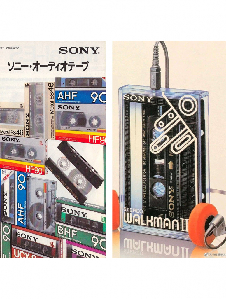
Sony: The Stack of Infinite Possibilities
No one represented the promise of home HiFi like Sony. Their 1986 ad is a vertical marvel: a towering stack of cassette decks, control centers, and digital tuners. It's a love letter to analog complexity—every button promising a new possibility. The clean Helvetica headline “Sony ’86” speaks to precision, while the German body copy grounds the tech in its serious, system-oriented context. Today, this kind of visual overload feels oddly comforting in a world of invisible streaming services.
 Copyright: Sony
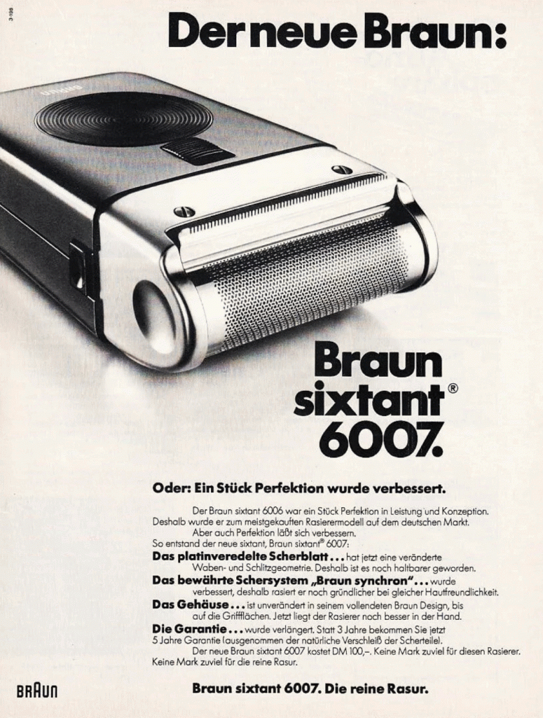
Braun: Clarity, Grid, and Quiet Confidence
And then, there’s Braun—the quiet innovator. Dieter Rams’ design language was all about clarity and control, and the advertising followed suit. The Braun ad included in our collection (see image) is pure structure: gridded layout, muted color palette, and typography that doesn’t shout—it informs. It's this visual discipline that helped shape modern design as we know it, influencing not just product design but also the very aesthetics of tech advertising today. Rams’ ten principles for good design live on—and this poster is proof. You can shop this timeless Braun print in our curated collection soon.
 Lifestyle, Products
 History
 Products, Design